Wall Street University: Betting Markets (Part II)
Building blocks of a Monte Carlo model and understanding covariance

In Part II of this series, we will discuss how to build the trading model, beginning with a sub-model for a single state.
By the end of Part II, we will generalize this to all 56 states and regions, utilize historical covariance and finally create a Monte Carlo model for the full simulation.
This installment covers the Easy and Medium aspects of modeling. For more advanced topics, raw data and Python code, check out Part VII.
This Series
Part II: Building Blocks & Covariance
Part III: PredictIt & The Mechanics of Markets
Part IV: The Best Bets (Statistically) & Two-Bet Portfolios
Part V: Optimal Portfolios & The Efficient Frontier
Part VI: Polling Models, Internal Models & Large Portfolios > $20,000
Part VII: The Math, The Code & Visualizing 10,000-Dimensional Spaces
Part VIII: 2018 Elections & Becoming a Portfolio Manager
Building Blocks
One State
The first step in creating the full model is to forecast results for a single US State.
The goal is to not only estimate the probability of whether a candidate will win or lose the state but also by how large of a margin. The voting margin in each state becomes an important input to determining the popular vote, whereas the mere win/loss determines the electoral vote. There are betting markets for both Popular, Electoral and a parlay of both markets.
For this mini-model, I’ll use Pennsylvania as an example. PA is a useful illustration because it’s a swing state and the probabilities are not so extreme as to be trivial. I’m also from PA, so it’s a subject close to my heart.
Normal Distribution
To model each state, we will use a Normal Distribution with assumptions about the Mean or “Expected Value” and Standard Deviation.
In the “Data” section below, I explore how to estimate mean and standard deviation. For the moment, just take the numbers as a given for this example.
Mathematical notation typically denotes Mean as µ and Standard Deviation as σ.
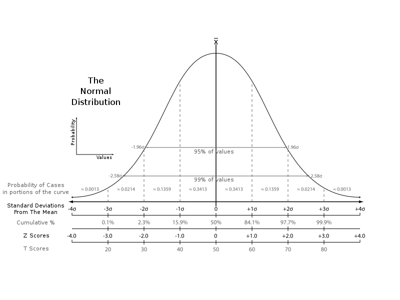
In a normal distribution, the probability of outcomes higher or lower than the mean (average) are 50/50. The magnitude of those variations from the mean are measured by the “standard deviation” — taken together, the mean and standard deviation work as powerful tools for predicting the probabilities on real objects or events.
The Normal distribution appears frequently in nature and human behavior. Stock market prices, the height of a person, intelligence, the weather and even molecular movement follow this pattern.
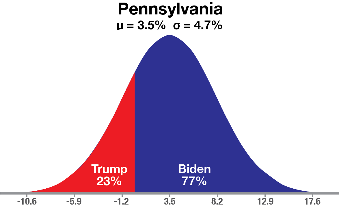
Here is Pennsylvania modeled as a normal distribution with Biden leading by 3.5% as the Mean and StDev of 4.7%.
Given these inputs, Trump’s chance of winning Pennsylvania is 23% or a 0.74 StDev event. This is not unlikely, but still gives Joe Biden 3x better odds of a win in PA.
Most importantly, the normal model allows us to not only forecast win/loss probabilities, but the probability of any specific margin of victory.
For example, Trump winning by +6% is a (0.06 + 0.035)/0.047 = 2.02 StDev event, or about a 1-in-50 event.
Forecasting margin is also necessary to calculate the popular vote.
Random Sampling
For reasons that I'll explain in detail later, we are going to use a Random Sampling or Monte Carlo method for valuing these markets (explained below).
Specifically, each time a simulation is generated for Pennsylvania, a random variable is generated in my Python script with a “Standard Normal” distribution. Standard normal means the variable is µ = 0 and σ = 1.
If you are working with Excel or any other language, another way to create a standard normal variable is by calling a plain vanilla “uniform” random variable and passing it through a “Normal Inverse” function to convert to standard deviations. In Excel, the formula would look like: =Norm.s.inv(Rand())
With either method, the outcome is a random standard deviation. This value is sometimes called a “Z-Score”.
Random simulations of the Pennsylvania vote are then estimated as:
z-score*σ + µ = Simulated Pennsylvania Margin
That is the average expectation plus the standard deviation times the random variable which creates that simulation.
Each time the random variable is called, a new simulation is created.
(If any of this isn't clear, the Monte Carlo section discusses in more detail.)
Covariance
Now we can discuss scaling up to a full national model.
The mini-model for one state is replicable for all 56 voting regions (50 States + Washington D.C. + Maine/Nebraska congressional districts).
If the means and standard deviations are known for all 56 regions, it is easy to model them each Independently. But modeling all 56 together is still a difficult problem.
To accurately model how all the states would vote in each simulation, it is not enough to just generate each state simulation. Additionally the states must display the correct co-movement or “co-variance”.
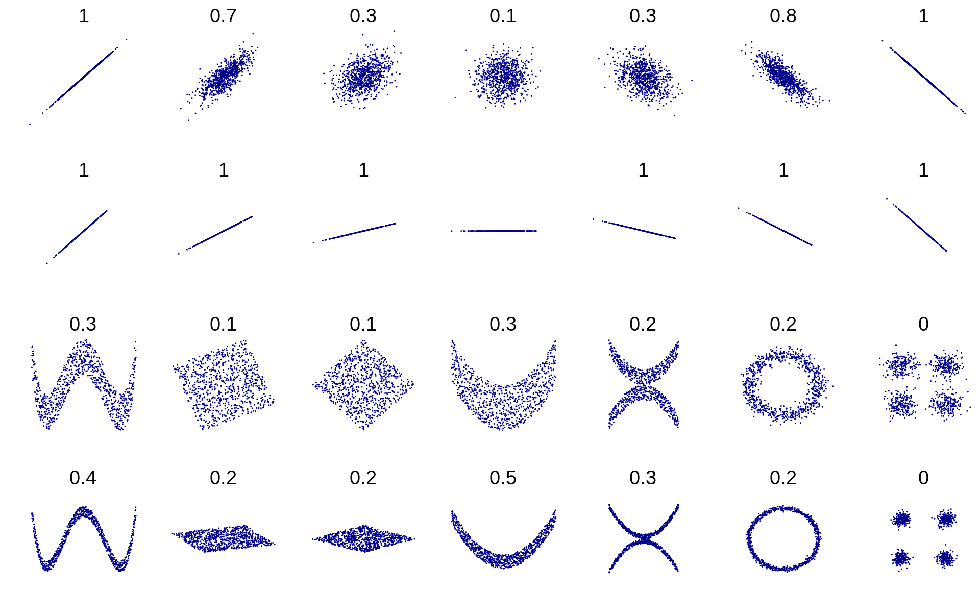
What is Covariance?
Covariance is a measure for how two things move together or “co-vary”.
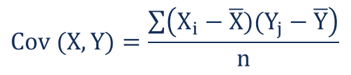
Technically speaking, the covariance between the values of two objects, X and Y, is how much you can “Expect” Y to differ from Y’s mean based on how much X differs from X’s mean.
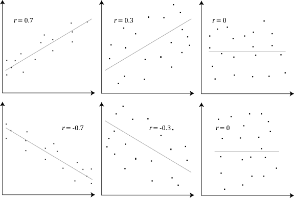
If X and Y have a positive covariance, as seen in the upper left example of r = 0.7, then when X is small, the best estimate for Y is being small as well.
Conversely, if covariance is negative, like r = -0.7, then when X is large, Y will be small.
A covariance of zero means that the size of one value does not give any information on the value of the other.
Covariance vs. Correlation
Covariance and correlation are similar concepts that are often used interchangeably, since they always have the same sign.
Correlation is just covariance divided by the standard deviation of each variable. It is covariance normalized to a range from -1 to +1, sometimes colloquially referred to as -100 to +100.
A simple analogy is that correlation is like saying “Percent”.
Covariance expresses a relationship in real world units of mass, speed, dollars, etc., whereas correlation is similar to a percentage that divides out the units and puts all the values on a scale of 100.
“The national debt is $26 Trillion dollars, up from $20 Trillion” is a statement with units and magnitude, like Covariance.
“The national debt is up 30%” is a normalized ratio, like Correlation.
You won’t get in too much trouble if you use them interchangeably in normal conversation, as long as you are precise where it counts: Math and Code.
Historical Relationship
To calculate the covariance between the states, I began with historical data from the presidential elections in years 2000, 2004, 2008, 2012 and 2016.
Taking the margin-of-vote (Democrat - Republican), yields 5 values for every state. The change in the margin-of-vote between each election creates a vector of 4 values for each state. From these 56 vectors of dimension 4, the covariance or correlation can be easily calculated.
How do states and regions actually move relative to each other?
The answer may surprise you.
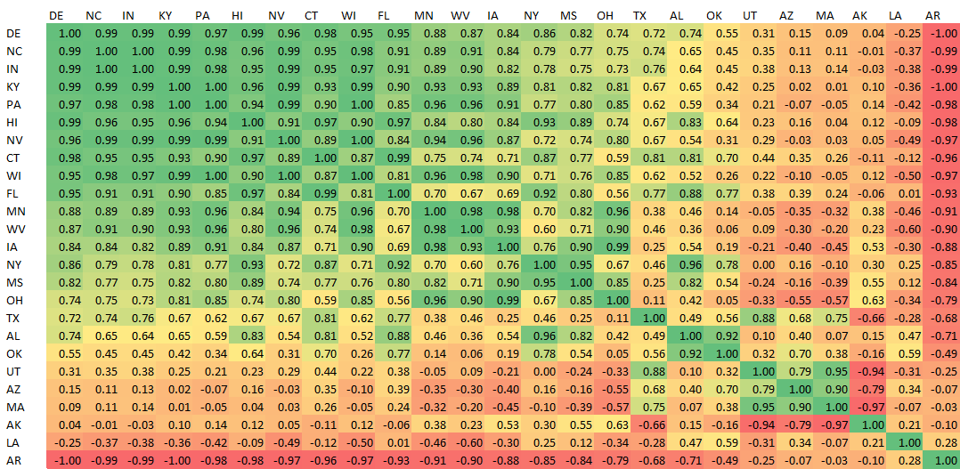
I would expect regions that are culturally and geographically similar to move together (positive correlation). While that is broadly true, some of the relationships are bizarre. Comparing Mississippi to 3 of its neighbors in the Deep South, shows varied results.
Mississippi and Alabama move together with correlation +82%. This makes sense.
However, Mississippi and Louisiana bear almost no relationship, at +12%. While Mississippi and Arkansas move in perfectly opposite directions at -84%!
Meanwhile, places that couldn’t be more geographically, culturally or economically different maintain tight relationships. Hawaii and Kentucky move together with correlation +96%, a near perfect match.
This is not because HI and KY are voting similarly — far from it! Hawaii is deep blue and Kentucky is very red. However, their changes in margin of vote from one election to the next mirror one another.
The best explanation for this behavior is that both states are responding to national Confounding Variables.
Both states experienced the same fluctuations in the national sentiment and as well as the economic situation. For example, the drop in public support for the Iraq War, fallout from the 2008 financial crisis and the economic recovery of the 2010's.
Through this lens, it makes sense that so much of the US voting moves in similar directions. It is almost more odd that there are any negative relationships at all.
For another example of strange correlations, look at how bizarrely Massachusetts behaves relative to every other state. MA bears almost no relationship to any states except Arizona and Utah!
Maybe it's because of Tom Brady…
Multidimensional Normal
To correctly model the interstate relationships (1,540 in total), we need to expand on the normal model from the last section to a Multidimensional Normal Distribution.
This type of model will allow us to explore the joint-probabilities of two or more events and incorporate covariance.
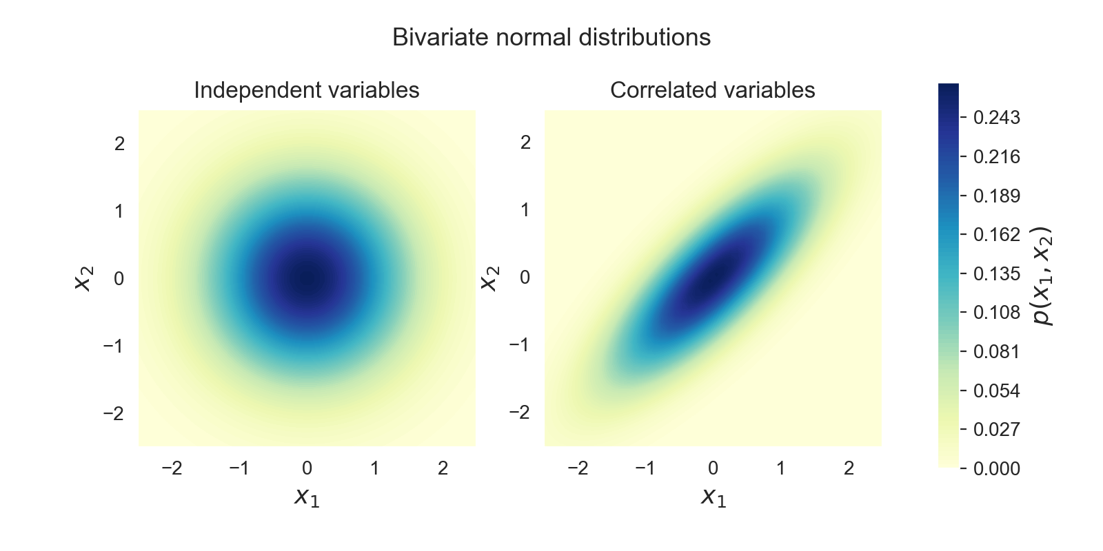
The example above shows two examples of two variables each. All of the variables are µ = 0, σ = 1. In the left diagram, the two variables are Independent.
It’s easy to see in the correlated example how much more probable extreme but common events become (both values negative or both positive) and how much less likely for the signs of the variables to be opposite.
Part VII will explore the heavier math on how to translate 1,540 relationships into a cohesive 57-dimensional probability space.
For now, just think of it like the one state example above. It is easy to map a random variable into simulated election outcomes with a few lines of Python.
Circus Mimes and Catastrophic Failure
Before continuing to the Monte Carlo model, I want to touch base on the importance of understanding Covariance, Causality and Confounding…
Covariance is actually one of the hardest concepts to grasp in finance, engineering, and statistics. It combines the human mind’s already limited ability to understand probability with multiple variables, higher dimensions and a total lack of intuition.
The very idea of covariance or causal relationships cannot be proven — only inferred.
Not a Constant
What’s worse is that these examples are all treating covariance relationships as though they are fixed, a constant to fit into an equation.
In real world phenomena, the relationship between different variables changes, often as a function of some third, hidden, object.
In finance, it’s well known that when the market starts crashing, correlations go to +100.
Looking at historical data, it’s clear that correlations and covariances follow regimes, which maintain one behavior for a while, then suddenly change to a new regime.
In my own trading and modeling, I use Hidden Markov models in lieu of closed-form equations. They are more robust and faithful to reality.
Confounding Variables
Ignore correlation at your own peril.
There’s an old story about a guy who has never seen a mime before. In his 40 years living in a small town, he never witnessed a street performer of any kind. In his estimation, the chance of seeing a mime on any given Tuesday might be 10,000-to-1. And that would be accurate.
But what about seeing three mimes? Is it 10,000 cubed? 1-in-1 Trillion?
No…

The next week, he walks into Starbucks and sees three mimes in line for coffee.
Why?
The circus is in town, or the local high school is doing a performance. It might be a TikTok video or reality TV show.
All of these are confounding causes. The chance of seeing three of a rare event simultaneously turned out to be almost as likely as seeing just one.
This is the same reason insurance companies (especially reinsurance companies) treat earthquake policies so differently than fire policies.
It’s common to lose 10–15 buildings per day to fire on a portfolio of 1,000,000 insured properties. The insurance premiums easily cover these uncorrelated losses. That’s the whole point of pooling risk.
But a major earthquake won’t happen for decades on end, but then suddenly cause $500 Billion in damages. Even Berkshire Hathaway couldn’t cover that indemnity.
The Good, The Bad & The Ugly
A deep intellectual and intuitive understanding of covariance is extremely rare.
On Wall Street, the difference between a passable understanding of correlation and a deep knowledge and ability to quantify the invisible, is the difference between a modest career and a Master of The Universe.
Improper (or superior) knowledge of these relationships has led to either the crumbling of empires or the building of fortunes.
Historical examples of covariance in action (3 Losses and 1 Win) :
- The 1987 stock market crash which caused $2 Trillion in losses was the result of Portfolio Insurance that made poor assumptions about correlation and liquidity.
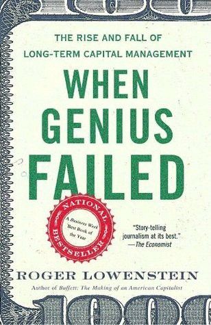
- The failure of Long-Term Capital Management in 1998 was a result of poor risk management. The implications of a regime change should have been understood by the firm’s two Nobel Laureate founders and creators of the Black-Scholes-Merton Model.
- The 2008 Subprime Crisis was largely caused by an assumption that housing prices could fluctuate in one region but could not drop in unison nationally (Correlation to +100).
- A positive example of using erroneous correlation assumptions for gain is Cornwall Capital’s 2011 short against the Euro. Rather than purchase put options for 450 basis points, they were able to use bad assumptions about the EUR/CHF, CHF/AUD and EUR/AUD currency pairs to buy (almost) the same option for 1/10th the price. That bet went on to make a 600% return for their hedge fund.
Visualizing the Invisible
It helps to have some mental heuristics and shortcuts for visualizing these relationships.
Covariance is the risk that few can count, most ignore and none correctly understand.
My favorite method for imagining correlation is called “Cosine Similarity”. This article gives an excellent explanation of the relationship between Pearson Correlation, Inner Product and Cosine.
While you still won’t be able to visualize 10,000-dimensional spaces with ease, this method works well enough in 2-D and 3-D spaces that I trust you can extrapolate the concept.
The human mind, with some imagination, has a remarkable capacity for analogy and generalization.
Monte Carlo
Let's return to the trading model…
At this point, we have the necessary data, mini-models and covariances to simulate a full, 56-region, 538-electoral-vote model, with precise margin of vote in each state. The model accepts an input of 56 random (truly independent and random) variables for each run of the simulation.
This type of model with random generation is called a Monte Carlo simulation.
Monte Carlo simulations rely on repeated sampling of a model to obtain numerical results. Monte Carlo methods are useful for problems that cannot be easily resolved into Closed-Form solutions. Instead, by calling the model thousands of times with random selection, a good approximation can be gained of the solution.
For our one state model, it would have been easy to solve the normal distribution’s formula directly without the use of Monte Carlo. With two states and one correlation factor, the problem would become more complex. After 4 or 5 states, the number of covariance terms growing as the square of the states, the problem quickly becomes onerous.
Even with some clever Matrix Algebra to manage all the coefficients, you would still need to solve a different version of the formulas for each of the 130 markets on PredictIt. This would be difficult, and it leaves too much room for human error to gain only a few decimal points of accuracy.
That’s why the Monte Carlo method is preferable and robust.
10,000 Simulations
For a model like this, using 10,000 simulations is a good rule of thumb. 10,000 is a large enough sample size to numerically evaluate each market with little variance or randomness, but it is still small enough to export to Excel for visualization. At that size, files rarely exceed 25 MB and the model runs in under 5 seconds on a laptop.
I could easily run the simulation 1,000,000 or more times, but the improvement in estimation is dwarfed by the inherent errors in the model and assumptions; therefore little is gained.
Output
Once the model has simulated the 56 regions, it is easy to calculate the presidential winner, popular vote margin and any other specific market outcomes. There are 130 markets in total, which will each resolve to either 0 or 1.
Therefore, the output of the model is a 10,000 x 130 array of 0’s and 1's.
At this point, the model is now useful to evaluate betting markets. The probability (Expected value) for each market is simply the percent of wins in the 10,000 simulations.
For example, the model simulates 10,000 runs of the Electoral Votes, with Joe Biden achieving 270 or more votes (270 is the necessary majority for victory) in 7,476 of the 10,000 simulations.
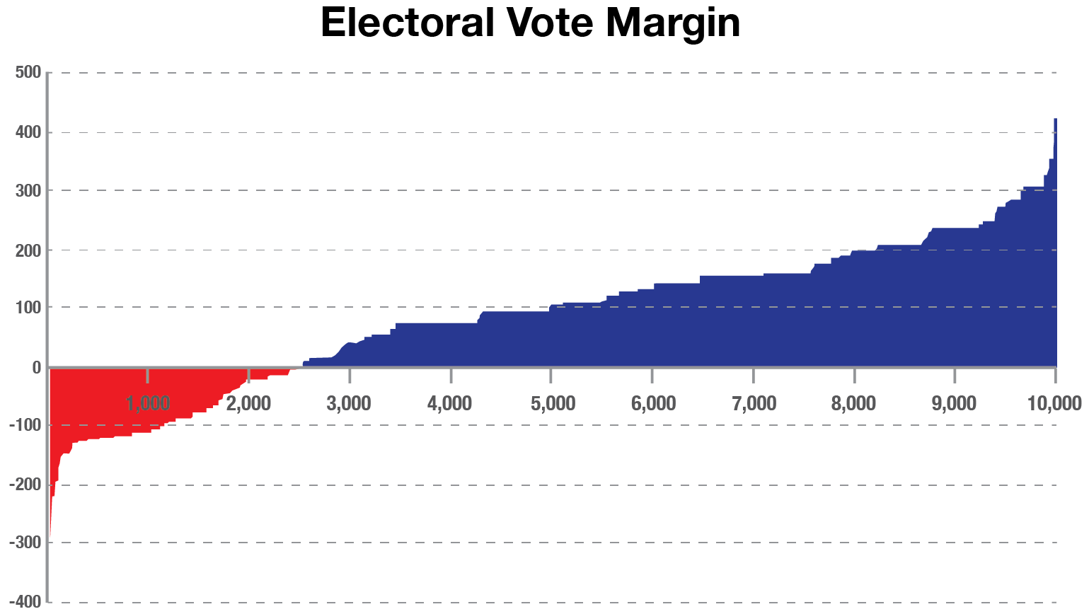
For this bar chart, the simulations are sorted by the net number of electoral votes over 270. The leftmost 25.2% of simulations show Trump winning and the rightmost 74.8% with Biden winning.
Notice how the distribution increases in steps, not in a smooth curve. That’s because of the discrete win/loss of electoral votes in each state. Texas is one of the largest steps, with 38 votes.
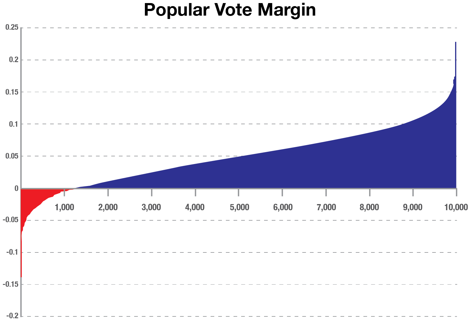
For the popular vote, notice how smoothly the distribution increases. Additionally, Trump only wins the popular vote in 1,291 of the simulations (12.91% vs 25.2% for the electoral college).
There are a large number of scenarios where Joe Biden will receive the most votes but still lose the election. This is what happened for Hillary Clinton in 2016.
There are even very, very rare combinations where Trump could win the popular vote but lose the electoral college (16 out of 10,000). PredictIt offers a market which combines these two edge cases.
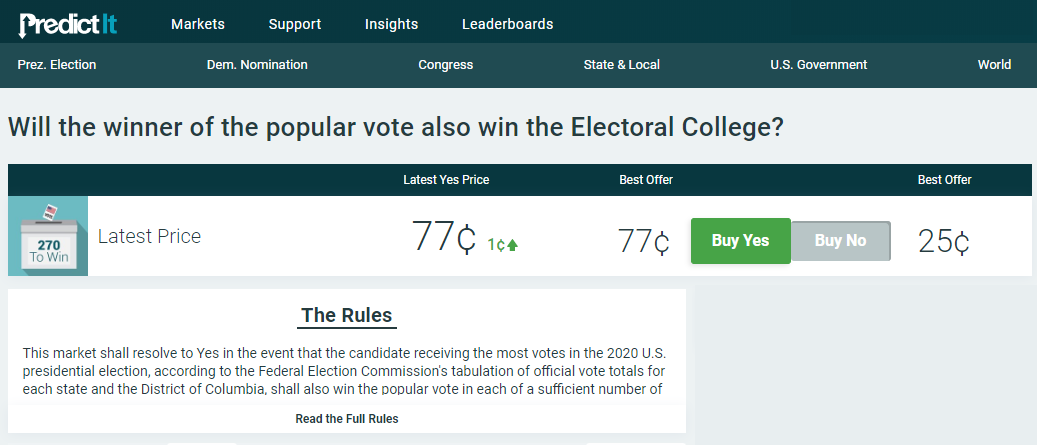
Technically, this is a market combining the two vanilla cases (Biden wins both popular and electoral, or Trump wins both).
However a bet against this market implies that the edge cases are trading at 23%.
Joint Events
Monte Carlo simulations are particularly adept at exploring compound events like this without much extra work.
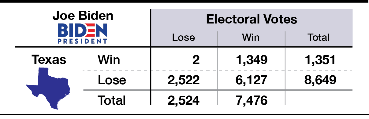
Here’s an example of how bets play out if you were to bet on the Presidential market and the Texas market.
Part IV demonstrates how to find two-bet combinations that typically payoff whether Trump wins or Biden wins. Part V generalizes to find the optimal combinations of all 130 markets.
Data
Now it’s time to discuss sourcing the primary data: the Mean and StDev for each state and the covariance relationships.
There are 3 main areas from which to draw data:
- Historical voting
- Current polling data
- PredictIt markets themselves
I use different combinations of this data across several models to test how robust the conclusions (optimal bets) are to differing assumptions.
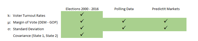
As mentioned earlier, the covariances are drawn from the historical voting circa 2000–2016. I did not include 1992 and 1996 because a stronger-than-average showing by a third-party candidate (Ross Perot) made it difficult to compare Republican vs. Democratic margins on an equal basis.
Standard Deviation
The σ input can be inferred by one of two methods:
- Directly from PredictIt markets by calculating the Z-score of each probability (plus some lite regression)
- Through a blend of the historical variance and the polling uncertainty
The exact methodology is covered in Part VII. Notably, both methods produce approximately the same StDev for each state. This simplifies which version to use since they corroborate.
Mean
Mean is, by far, the most important input and the most inconsistent across sources.
The overarching theme of this data is that polls are far more favorable to Biden than the PredictIt markets. Polls show Biden with a 94.8% chance of winning. Whereas PredictIt only gives Biden 62%.
Different assumptions about the Mean are the basis for creating four variations of the model (details in the next section).
These models range from a version that is purely based on Polls to a version purely implied from PredictIt. There are also 2 versions in between, which preserve the information from quality polling data but bias the µ to be more consistent with PredictIt levels.
Voter Turnout
What could arguably be the least interesting of all, is the voter turnout. It is the percentage of a state’s population that actually votes. This has only one use in the model: converting all of the 56 state margins into a national popular vote.
Voter turnout rates are calculated by taking the average of the last two elections.
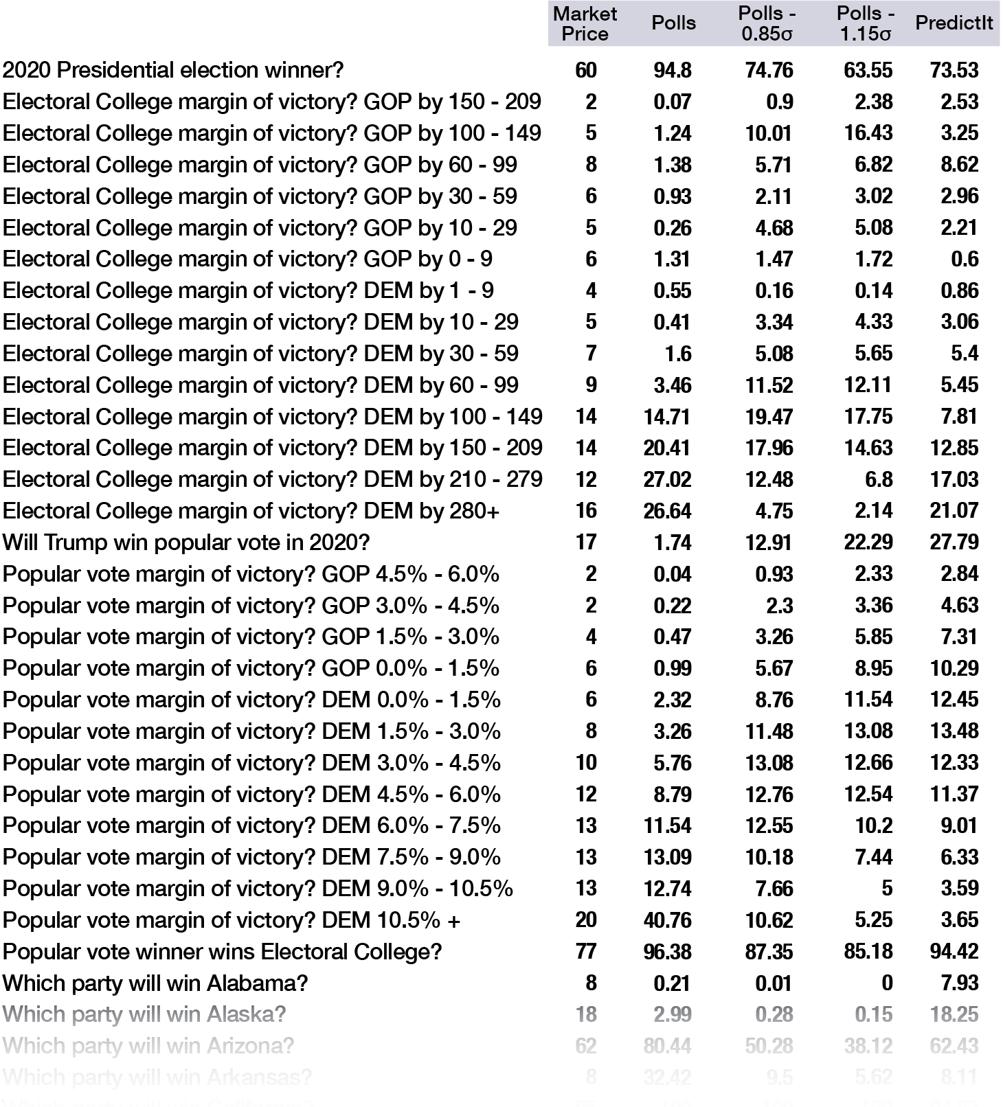
Four models
The four models are a spectrum from the pure polls model, which strongly favors Biden, to pure PredictIt, which puts him at 3-in-5.
An important observation is that the pure PredictIt Model, which draws from the market price in each state race, is internally inconsistent.
PredictIt is internally mispriced. The market for the Presidential Election gives Joe Biden a 62% probability of winning, but the Monte Carlo model with PredictIt inputs gives Biden a 74% chance.
An alternate explanation of this inconsistency is that the betting markets are implying a higher covariance between states than our historical model.
Compromises
As a result of these inconsistencies, I have created four flavors of the model to test different combinations of data:
- Polls Only
- Polls - 0.85 σ (matches PredictIt internal 74%)
- Polls - 1.15 σ (matches PredictIt market 62%)
- PredictIt (Internal)
The Polls - 0.85 σ and Polls - 1.15 σ each take the version based purely on polling data and regress them back a bit (move the mean) until they align with PredictIt.
Polls - 0.85 σ has an adjustment factor, -0.85 StDev— which is enough to line it up with the individual state markets — and gives Biden 74% chance of winning. The second model uses a more aggressive adjustment of -1.15 StDev to be consistent with the presidential market, with Biden at 62%.
To emphasize just how large of an adjustment factor a Standard Deviation is for a probability:
- -0.85 σ adjustment is equivalent to changing a 4-to-1 bet to 1-to-1
- -1.15 σ is like transforming 7-to-1 into 1-to-1. It converts a 12.5% event and makes its a 50% event.
Here’s a comparison of the PredictIt market prices and the four models.
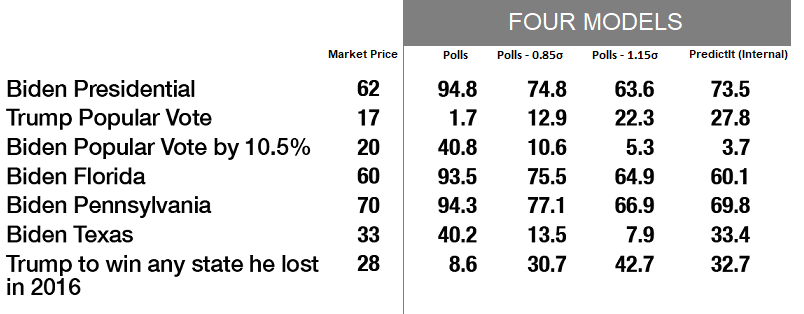
Polling Data
Generally, I believe the polling data is more accurate and less extreme than PredictIt.
For example, PredictIt shows Biden with an 18% chance in Alaska, whereas polls say 3% and my compromise model says 0.3%. (More in “Polling as a Science” section below).
The best version of the model is probably a blend of the two, utilizing the specific levels from polling data with an adjustment factor to create consistency with PredictIt.
Internal Arbitrage
One might argue that if the polling data is most accurate, then we should use that model and place large bets in the most mispriced markets. However, this strategy would invariably result in huge bets on Biden, both directly and indirectly.
Someone else might argue that we should use the compromise models, which remove that systemic misalignment between polls and PredictIt, — and focus on the remaining internal inconsistencies.
The latter strategy would produce a portfolio of bets that would pay off whether Trump wins or Biden wins.
Part VI and Similar Conclusions
It’s important to note that whether I use a polls-only model or the compromise model, the conclusions are structurally similar.
The compromise model will find bets that are internally inconsistent, with opposite correlation and prices, combining to make a near arbitrage.
The Polls model will produce a portfolio that has basically the same internal bets as the compromise model, but with more weight on pro-Biden bets.
Therefore, it’s totally reasonable to use the compromise model for most of this series, knowing that afterward I could always overlay more outright bets on Biden.
Furthermore, the compromise model will make the rest of this analysis and portfolio construction more interesting (though I know all this Math and Stats is already riveting!) since the bets will seem more evenly distributed.
For simplicity and more illustrative examples, I will stick to the Polls -0.85 σ model for the remainder of Parts II-V.
Part VI will address the other model outputs and recommended bets.
Reversion-to-the-Mean
One more point on using the Polls -0.85 σ compromise model... Regression to the mean is not an unreasonable assumption to make here.
Biden’s bump in the polls has been substantial, but recent. If history is any indicator, his favorability is more likely to revert back than continue on the same trend.
Additionally, the underdog is the sitting US President, which means he has more resources at his disposal in the coming months. Unlike Biden, the US President can give a live national address on every network, even daily, if he chooses. His travel costs and staffing are paid for by the government, and he has control over trillions in public spending.
Taking these points together, it might be very reasonable to bias the data back by 0.85 σ - 1.15 σ to match PredictIt.
Polling as a Science
Since polling data plays such a large part in the construction of these models, it would be incomplete to not address some of the criticisms of polls.
A common narrative since 2016 is that polls are unreliable and that they were “wrong in 2016”.
In reality, polls are actually very accurate.
Polling Accuracy
Polls provide data on public approval and voter intentions, but they also offer quantitative measures of their own limitations (Standard Error and Sample Size).
When polls are conducted with a consistent methodology (in-person, online, via random dial telephone, standardized scripts etc.), they offer information about the bias inherent in each sampling method.
Modern polling dates back to George Gallup in 1936 and polls have been very accurate since at least 1972. The 2016 presidential election was no exception.
Polls in 2016 predicted Hillary Clinton to win the popular vote by 2% — She won by 2.9 Million votes, almost exactly 2%.
State-by-state polls combined with Monte Carlo simulations (like my model) gave Trump a 30% chance of winning the electoral college, which he did.
There is nothing shocking about a 30% event occurring. According to the polls, Trump winning the presidency was about as likely as being born on a Tuesday or Friday. It’s as improbable as rolling a 4, 7 or 10 with dice, which is a 1-in-3.
National vs. State Polling
Why were so many people surprised by what happened in 2016?
A good deal of the blame lay with watching national polls instead of the swing states. Clinton gaining 5% in California or losing a few points in Oklahoma would have never affected the electoral landscape. Arguably, the media and individuals should have ignored the national numbers.
Also, most people are bad at discussing probabilities. If I said “Clinton has a 70% chance of winning” and then she lost, it’s inaccurate to say: “But you were wrong. You said 70%.”
Modeling the election was already difficult enough because both Clinton and Trump were the most unpopular (net favorability) candidates in presidential history. The fact that the polls and models were still so accurate is a testament to their reliability.
FiveThirtyEight
Since FiveThirtyEight’s model was the most followed and discussed, it’s worth taking a moment to discuss how they normalized polls.
Nate Silver’s FiveThirtyEight goes to great lengths to rate the quality of pollsters, normalize them by the historical bias in their sampling vs. election night and to average polls together.
In fact, I would argue that the 2016 outcome was a huge win and vindication for his model. Nate Silver gave Trump 30%, when other writers and statisticians gave Trump only 15%, 8%, 2% or 1%.
For what it’s worth, the Trump campaign also estimated his chances at 30%.
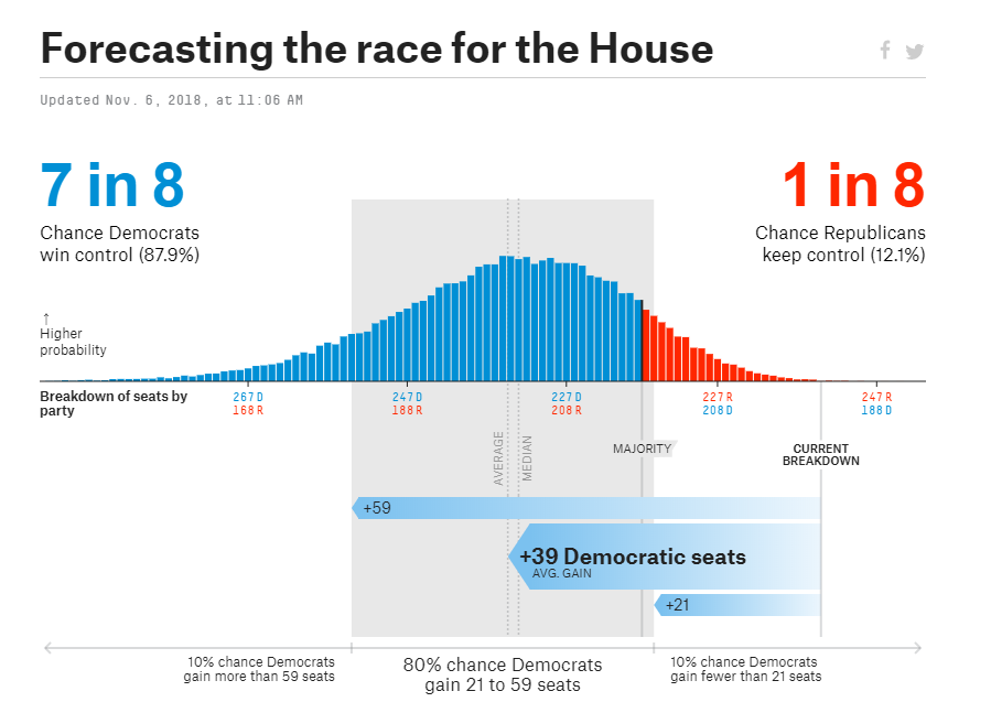
FiveThirtyEight’s success with utilizing polls continued in 2018 when their model for the House of Representatives forecasted Democrats flipping 39 seats from Republicans and winning a majority in the House.
Pundits again repeated warnings that 2016 showed polls to be inaccurate. Why trust them now?
In the end, Democrats gained 40 seats and won the House. Almost perfectly matching the FiveThirtyEight model.
Next Section
This was the longest installment in the series.
The next two parts cover PredictIt and the model’s predictions for the best bets.
Part III: PredictIt & The Mechanics of Markets
Part IV: The Best Bets (Statistically) & Two-Bet Portfolios
Collaboration
For any interesting projects or research, or if you just want to discuss some topic, please reach me at: nickyoder10@gmail.com
Don't forget to sign up for weekly updates to the model, polls and optimal Bets! As market prices change, public polls change and the time until election decreases, I'll update these every week.